
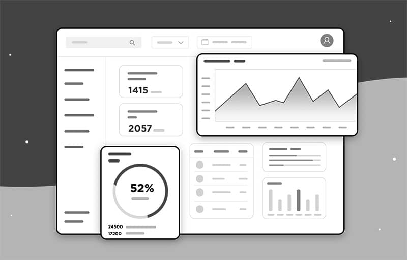
Dashboard (UI/UX) Design
Transform your data into stunning, user-friendly dashboards tailored to your business needs!
Importance and Usability of Dashboard UI Design
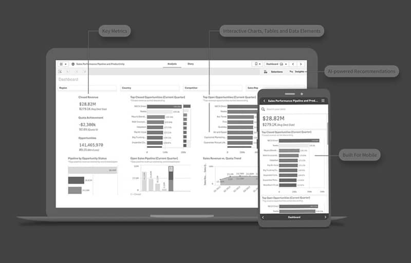
The first and most visible part of a dashboard design is its user interface or UI. It determines the first experience that comes to the user’s eyes. A successful dashboard UI is designed in such a way that users can easily find information and complete the necessary tasks without any complications. Visual elements like color, typography, icons, and layout play an important role here. When a user uses an application or software for the first time, their attention and experience depend entirely on the UI design.
Thinking about the user experience: The impact of UX design
While UI design is something to see, UX design is something to feel. It refers to the entire journey that a user experiences when using a software, application, or website. A good UX design means that when a user performs a task, it should be done naturally, with very few clicks, and without any worries. In a dashboard, the user interacts with various features, reports, and multiple sources of information. If the UX design is weak, the user may repeatedly click in the wrong place, or waste time searching for information—resulting in frustration and eventually abandoning the software.
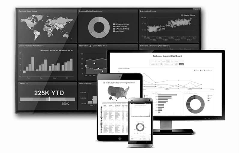
The need for device-based responsive design
In today’s era, people are working not only on desktops—but also on laptops, tablets, and even mobile devices. Therefore, an effective dashboard design is successful only when it works properly and provides the same experience on all types of devices. This is responsive design—where content, buttons, and reports display naturally, regardless of the screen size. Corporate software, such as HR management systems, finance tracking, or project monitoring tools—are now often used on mobile or tablets. If the design is not responsive, users will get bored while scrolling, miss important information, or accidentally select the wrong option.
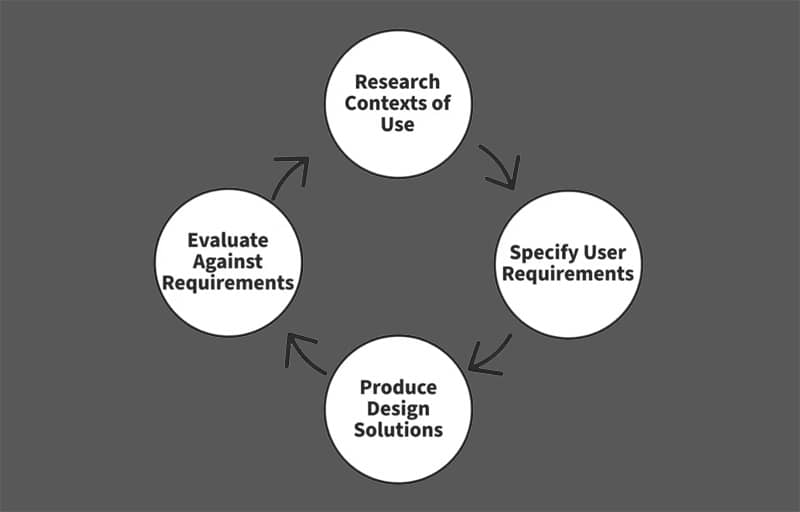
What an integrated UI/UX-based dashboard should look like
A properly designed dashboard is an interface that balances information, functionality, and user experience. It doesn’t just have to have a great design, it has to be usable. Not only should it be functional, it should also be attractive. Dashboards that combine UI and UX design are the most effective for the user. For example, a good finance dashboard has balances, transaction history, analytics, and alerts all in one place, but it is presented in such a way that the user understands which information is most important. Similarly, if an HR dashboard has employee attendance, leave requests, performance reports, etc.
